It’s the bomb

A friend asks “So what is up with this bomb cyclone term? Is it just a blizzard with a more compelling name? Or is it something unique that I have not experienced before now? Is bomb cyclone a technical term?”

Answer: like “polar vortex”, “bomb” is a term that has been used by meteorologists for many years but is just now being brought into popular usage by weather media. It refers to a winter storm over the ocean that strengthens very rapidly – the technical requirement is that the minimum surface pressure drops by at least 24 hectopascals (hPa, also known as millibars, or mb) in 24 hours. The term was brought into the scientific literature by Fred Sanders and John Gyakum in a 1980 paper, here:

http://journals.ametsoc.org/…/1520-0493(1980)108%3C1589%3AS…

a less technical and more recent discussion is here:

https://www.fastcompany.com/…/is-bomb-cyclone-even-a-real-t…

a bit more history and some quotes from Gyakum:

https://www.huffingtonpost.com/…/bomb-cyclone-definition_us…

And if you want to know more about the polar vortex while you’re at it: Darryn Waugh, Lorenzo Polvani and I wrote an article about that term for the Bulletin of the American Meteorological Society that is a bit more scientific than what you’ll find in the mass (or social) media, but more accessible than a typical peer-reviewed research article:

http://journals.ametsoc.org/doi/pdf/10.1175/BAMS-D-15-00212.1

The unbelievable coincidence of Cyclone Ockhi, Mumbai and me

On Monday evening, I will travel to Mumbai, India. I am going there for a research project in which we are trying to assess the risk that Mumbai might someday be hit by a tropical cyclone, particularly one strong enough to cause a significant storm surge and a major disaster for this low-lying coastal megacity. The problem is scientifically interesting – and difficult – precisely because such an event has not happened in modern history. So one can’t use historical data as a guide, although we know the risk is not zero – we believe that it has probably happened sometime, but it’s very rare our records are just not long enough. One has to use models of some kind to assess the risk, and our problem is to develop, evaluate, and use those models. (And climate change is most likely increasing the risk, but that’s another issue.)

Anyway, at this very moment there is a cyclone, named Ockhi, in the Arabian Sea. It is forecast to pass quite close to Mumbai on Tuesday evening, precisely when my flight (booked several weeks ago, and planned long before that) is due to arrive there!

ockhi_track_sunday_1130_est

While the storm is pretty powerful now, it is forecast to weaken a lot before landfall, so it will probably not cause a major disaster. And the models have it making landfall a bit to the north of Mumbai anyway (although with the uncertainty in the track forecast, a more direct hit is still possible). So this probably won’t be quite the disaster our project aims to address, but still, the coincidence is profoundly spooky. There are only 1-2 cyclones on average each year in the Arabian Sea, and most of those never come anywhere near this close to Mumbai. It’s an *extremely unusual* event, and it’s happening *precisely* as I’m coming to town to study it.

Paleo trash and unfrozen cavemen

Temperatures in NYC have finally risen persistently above freezing, and the ice and snow are starting to melt. In NYC one of the consequences of this is that all the garbage that was buried by the snow comes to the surface. The streets haven’t really been cleaned in weeks to months, and they are a mess.

It reminds me a bit of other things revealed by melting ice. Like Captain America in the movie… or, ok, if we want to be more real life-based, like Oetzi, the “iceman”, found in 1991 in the Alps between Austria and Italy. He was frozen 5000 years ago, and then unfrozen as the glacier he was in melted due to whatever combination of natural climate variability and anthropogenic warming.

So now today, we have scenes like this:

paleo trash march 2015

A little less scientifically important than Oetzi, but still, recent history (of a New York City sidewalk) preserved in ice and then revealed.

Of course, the most important artistic comment on this particular phenomenon is this.

Slush is life

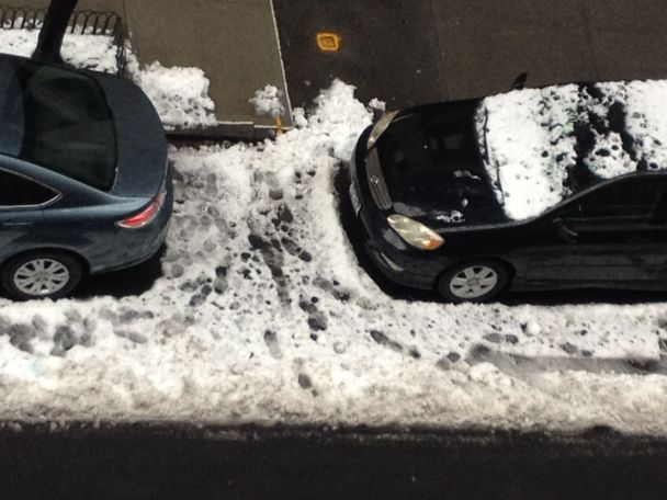
Last night into this morning we had a little winter storm pass through. The precipitation forecast was tricky. Here in New York City we were, as we often are in winter, very close to the rain-snow line. In the end, we got maybe a couple inches of snow, plus some rain. Walking around today was messy business, with big sloppy puddles and lots of slush. Here’s a photo from my window down onto the street:

slush_jan_24_2015

Many people don’t like this kind of weather. Many people would rather it were a little colder, so that we’d have nothing but clean white snow. (Of course in NYC it is only ever clean and white for a very short while, but never mind.) I get that. But actually, I like the slush.

Before saying anything else I have to admit that I don’t particularly like cold weather, period. I have mediocre circulation in my hands and feet. I get cold. I can enjoy some winter sports, but put me on the nicest ski slope around and then offer me the chance to be instantly transported somewhere warm and I’ll never say no. I grew up here and have lived here most of my life, but apparently I’m still not adjusted to the climate. I still find every winter a little harsh. And I know, a New York City winter is nothing compared to a lot of places.

Maybe that’s why I ended up working on tropical meteorology – thinking warm thoughts is part of my job. (And yes, occasionally I get to go to a conference or a field campaign in a tropical place when it’s winter here.)

So my appreciation for slush is partly about realizing that it could be even colder than it is. But it’s a little more than that. Slush tells us, in the most visceral way possible as it soaks through our shoes, how special a planet we live on. We can have slush only when the temperature is right near the freezing point of water, at which water can coexist in all three of its phases: solid, liquid, vapor.

A planet which has liquid water can support life. As scientists try to figure out if there’s life on Mars, looking for evidence of liquid water there seems to be most of the ballgame. And it’s only in a pretty narrow temperature range – compared to the range of possible planetary climates – that liquid water can exist; too cold and it all freezes (Mars, at least now), too warm and it all evaporates (Venus).

While we may need liquid water to support life, we don’t need ice. But the ice helps us appreciate the liquid. It shows us just how close we are to the edge. When it’s slushy, we can feel the transition between a frozen climate that is fundamentally inhospitable to life (sorry, Canadians, Midwesterners, Russians etc.) and one that isn’t. When I’ve been on a winter car trip to somewhere really cold and snowy, and I’m returning back to somewhere warmer, I always feel something magical at that slushy boundary in between.

On some days, we live right on that boundary. This was one of those days, in a particularly complete and interesting way. Let’s look at some data.

The picture below shows the local sounding — set of upper air measurements taken by weather balloon, plotted vs. height — from our National Weather Service station in Upton, New York (Long Island) from 7 AM local time this morning.

skew_KOKX_012415

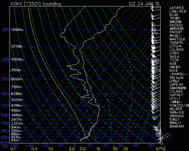
This is a “skew-T log-p diagram”. If you don’t know how to read one of these, I’m going to teach you what you need to know for today. It shows all the variables (temperature, humidity, wind) the balloon measured as functions of height, which is on the vertical axis just as you think it would be (see the white numbers just to the right of the vertical axis on the left, which give the height in meters; the blue letters to the left give the pressure, in hectoPascals). The higher you are on the plot, the higher the balloon was.

The two white lines are the temperature and dew point temperature. If they are on top of each other — as they are below about 5000 m (~3 miles up) — that means the atmosphere is saturated, relative humidity = 100%. Not a big surprise, as precipitation was falling when this balloon was flying.

More interesting is the temperature itself. The reason this is called a “skew-T” plot is that the axes are not at right angles — temperature is not on the horizontal axis, but rather on a tilted axis. The blue lines angling up to the right are lines of constant temperature, or isotherms. You can tell the temperature (in Celsius) of each one by the blue number where it hits the bottom. So a vertical line, for example, would mean the balloon is getting colder as it goes up, as it would be crossing blue lines with lower temperatures. In most soundings, from nearly everywhere on earth, the atmosphere does get colder with altitude, with only a few exceptions. (The word “inversion” is used to describe a layer where temperature increases with height; the word itself tells you right away that it’s an exception to a rule.)

Our balloon’s temperature trace, though, tracks right along one of the blue lines in a layer between about 1000 and 2500 m (or between 900 and 750 hPa, if you like). That means that in that layer, temperature was not decreasing with altitude, but staying the same – it was an isothermal layer. And not at any old temperature – the blue line is the one with a zero below it where it hits the bottom of the plot. That means that a roughly mile-thick slab of atmosphere was almost exactly at freezing.

Why would that happen? Most likely the layer started out somewhere in the vicinity of zero C, but with more variation — part of the layer was colder, part warmer. Then precipitation (ice, liquid, or more likely some combination) started falling through it, and freezing and melting. Freezing liquid warms the air by the latent heat of fusion, while melting ice cools it for the same reason. So layers colder than zero would be warmed by freezing rain, while warmer layers would be cooled by melting snow or sleet. This would bring the temperature everywhere towards zero.

Just above the surface, the sounding shows an inversion layer, where temperature increases with height, so any frozen precip had a little more chance to melt before hitting the surface – which was, itself, exactly at zero C, about to become the perfect environment for slush as sunrise warmed it a bit above that temperature.

In other words, not just the ground, but the atmosphere itself was slushy. Organically, perfectly so.

And tonight, the temperature will drop, and we’ll have black ice. I don’t think I’ll be able to write such a happy meditation on that.

Snow and availability in the Holy Land

I’ve been in Israel for the last two weeks, having been invited to give some lectures in the Geophysics department at Tel Aviv University. A major storm moved into the country yesterday, and hasn’t left yet. Here on the coast in Tel Aviv, there have been strong winds and rain. At higher elevations, there is snow, including in Jerusalem (about 800 meters, or 2500 feet, above sea level).

Here is a current map (actually a 12-hour forecast from the GFS model, valid around the present time as I write) showing the surface pressure and precipitation, with Israel in the lower right (northern Israel is right under the strong precipitation maximum):

gfs_pres_12h_eur

And here’s a map showing the upper level flow, 500 hPa geopotential height (contours) and relative vorticity (color shading); note the strong southward dip in the geopotential contours, indicating a strong distortion of the jet:

gfs_500_12h_eur

As it has turned out, the Jerusalem snow hasn’t been as big a deal as some had feared. There has only been a little so far, and it has been followed by rain washing it away. The preparations, on the other hand, had been massive, with roads and schools closed ahead of time and every level of government preparing for the worst.

The preparations for this event, when compared with last winter’s, manifestly show the role of the availability bias, as described by Daniel Kahneman in Thinking Fast and Slow, in human decision-making about risks from rare events.

One side of the availability bias is that we often don’t take risks as seriously as we should if they are risks of things that we have never experienced. This was evident, for example, in the failure of governments in the New York City area to invest in flood-proof infrastructure prior to Sandy, with the poster child being the South Ferry subway station. The new South Ferry station was completed in 2012 and totaled by the storm — despite well-documented evidence, going back at least 20 years, that a hurricane could cause just the kind of flooding that Sandy caused, in that precise spot as well as others. (See my book Storm Surge for details.) Now that Sandy has happened, things have changed and all kinds of investments are being made in more resilient infrastructure. But since until Sandy no such storm had happened in anyone’s lifetime in NYC, it was human nature to act as though it never would happen.

This Israeli storm is showing the flip side of the availability bias. Snow in Israel is relatively rare, but it happened in a big way last year. In December 2013, Jerusalem got a couple of feet of snow. It wasn’t taken seriously enough. People got in cars to drive from other parts of the country to Jerusalem to see the snow in all its novelty, and many got trapped on the road for long periods of time. The city didn’t have enough plows ready, power outages were more widespread than expected, and significant numbers of people had to evacuate to shelters. The country was taken by surprise, with serious consequences.

Not this time. Since a couple of days before the storm, the newspapers here have been full of stories about its approach and about all the government actions to get ready, including more plows, the school and road closings. The US Embassy issued a message to US citizens in Israel warning about the storm.

The forecast was for a big storm, to be sure, but not for one as bad as last winter’s. Having been through last year’s event, though, no way were those in positions of responsibility going to be caught off guard this time. When we have been through a rare and disastrous event recently, the availability bias tends to make us think it’s the “new normal”.

I am not saying that the authorities overreacted to the forecast this time. Their actions may well have been warranted, given some uncertainty in the forecast and the vulnerabilities of the region as demonstrated last winter. But it’s clear that the reaction is erring on the side of caution this time, compared to erring the other way the last.

Still, the storm has been impressive and exciting. I’ve put a short video on my facebook page showing the waves pounding the boardwalk at the Tel Aviv port, in the northern part of the city, last night.

Thanks to Pinhas Alpert for a discussion of the role of availability bias in the preparations for the present storm, to Nili Harnik for inviting and hosting me here, and many people here for accounts of last winter’s storm.

On seasonal forecasts for this winter

I was contacted by a reporter to comment on the apparently radical difference between different seasonal forecasts that are currently available for the upcoming winter here in the northeast. The private company AccuWeather predicts a cold winter for us, while the Climate Prediction Center, a US government facility under the National Oceanic and Atmospheric Administration (NOAA) predicts that a warm winter is more likely. This post is an expanded version of the comments I wrote to him by email.

Here is the map showing the current AccuWeather forecast for this winter.

accu

The map is accompanied by an article stating the forecast in words. It begins: “Though parts of the Northeast and mid-Atlantic had a gradual introduction to fall, winter will arrive without delay. Cold air and high snow amounts will define the season.” Those are confident statements, with no expression of uncertainty. The rest of the article is the same.

Here is a salon.com story based on the AccuWeather forecast.  The headline is “Bad news, America: The Polar Vortex is coming back!”

Here is a map showing NOAA’s temperature forecast  for December through February in graphic form. (Original link here).

noaa_map

It shows warm for the northeast, where AccuWeather showed cold. But I am not really interested in that difference. The more important difference is that NOAA’s map shows probabilities.

The NOAA map states the forecast in terms of the probability that the temperature will be normal, above normal, or below normal. These are defined as terciles, or ranges capturing 1/3 of the historical data – 1/3 of all winters have been in each range. Thus if we had no other information (no current weather data, no forecast models, etc.), we would say there are equal chances of above normal, normal, or below normal – the chance for each would be 33%. Areas where this is the case in NOAA’s judgment are shown as white on the map. Red means the chance of above normal is significantly greater than that for below normal, blue means vice versa. The probabilities for either above or below are nowhere much greater than about 50%, meaning that even where it’s red, for example – meaning warm is more likely – there is still a significant chance of cold. In other words, the forecast is uncertain.

Here is a USA Today article with some statements from NOAA CPC Acting Director Mike Halpert, expressing that uncertainty in words.

The current state of the science is such that seasonal forecasts such as these have only a modest amount of skill, even in the parts of the world where they are the best. That means if you were to bet on them every season for many years, you would make money in the net, but not a lot. The tercile probabilities, with their modest departures from 33%, communicate that.

Further, the eastern US is an area where the forecasts are particularly unskillful. (The west coast, for example, is more strongly influenced by El Nino events such as the one that is trying to get going now, and more predictable as a result of that.)

So a confident forecast that a cold winter (or a warm one) will occur, with no statement of uncertainty or probabilities – such as AccuWeather’s – gives an exaggerated and misleading impression of the degree of certainty that is possible.

The NOAA forecast is truer to the science, in that it is stated in terms of probabilities, and does not express a high degree of confidence in any one outcome. That  doesn’t mean it won’t be a cold winter, as AccuWeather says; it might be. It just means there is no way of being anywhere near as certain as their forecast implies.

That said, AccuWeather may be taking their cue from our normal daily weather forecasts (including those from NOAA, of which the National Weather Service is a part). Those too, really, should also be stated in terms of probabilities, but are not. (Actually, they are, for precipitation, e.g., 50% chance of rain, but not for temperature.) So perhaps AccuWeather thinks people are more comfortable with deterministic forecasts, and thus choose to provide deterministic seasonal forecasts as well, even though they know (I have to assume they know) they will be wrong a good fraction of the time. I think that is unwise, given the low skill of seasonal forecasts in particular; it gives the public the wrong idea about the nature of the information they are being given. I believe most people are capable of understanding basic probabilities, and would be better served by forecasts stated in those terms.

I have not addressed why AccuWeather is going cold for the northeast while NOAA is going warm. I don’t know the answer to that. I am pretty sure they have access to most or all of the same information and just interpret it differently. But in my view it would be misleading to focus on this difference. The more important point is that both forecasts are uncertain, and should rightly be expressed in terms of slight changes in the probabilities. NOAA does express it this way, while AccuWeather doesn’t.

Finally: without looking at any weather data or models, one can say pretty confidently that it is very unlikely that this winter will be as cold as last winter was in the eastern US. Last winter was very extreme by historical standards, so a winter that extreme is – basically by definition – improbable in *any* year. No information currently available (including the state of El Nino), or that will be available ahead of time, is strong enough to change that. Again this is a probabilistic statement: it’s not impossible that this winter will be as cold or colder than last, it’s just very unlikely.

Hudhud at landfall

2014IO03_4KMIRIMG_201410120100

So while Vongfong was the big weather story a few days ago – when it reached intensities close to Haiyan’s last year – it is now down to low category 1 intensity, and forecast to weaken further before reaching Japan.

In the meantime, a new tropical cyclone has formed in the Bay of Bengal, strengthened dramatically, and is now in the process of making landfall in Visakhapatnam, Andhra Pradesh, on the east coast of India. The peak winds are estimated by JTWC at 110 knots, a high category 3, nearly category 4 cyclone. This has the potential to cause great destruction. The image at top shows the most recent enhanced infrared satellite image of Hudhud, taken from CIRA.

Here is a recent story in the Guardian reporting that “hundreds of thousands” of people are being evacuated, and a story in Slate by Eric Holthaus. As Holthaus notes briefly in his story (and more on twitter) the India Meteorological Department has estimated Hudhud’s intensity at much lower values than other agencies have; IMD currently is calling Hudhud a 90-knot storm as opposed to JTWC’s 110). But the mass evacuations attest to the seriousness of the Indian government about this storm. Cyclone Phailin, last year, was similarly powerful, and also was the subject of dispute between IMD and foreign meteorologists, with the IMD calling the intensity lower in that case as well. The preparations and evacuations for Phailin were remarkably successful, keeping the death toll very low by historical standards. Hopefully the same will be true this time.

Here’s a surge and inundation forecast from IMD, predicting peak values in the 2 meter range for Visakhapatnam.

surge_imd

Typhoon Phanfone – a post that will be immediately out of date

Typhoon Phanfone has been closing in on Japan for days, and is in the process of making landfall as I write.

The storm earlier had made it to the bottom end of category four on the Saffir-Simpson scale, with peak sustained winds of 130 knots and a very small “pinhole” eye. The pinhole eye is almost always a sign of a scary storm, because the way tropical cyclones develop really strong winds is by contracting their eyewalls inward. As with a skater who pulls her arms in while she does a spin on the ice, conservation of angular momentum increases the rate of rotation because the distance from the axis has shrunk.

By now the storm is considerably weaker, with peak sustained winds estimated at 80 knots, category 1. According to the cyclone phase space diagnostic of Prof. Robert Hart at Florida State University, Phanfone is in the process of extratropical transition, turning into an extratropical or “winter” type storm. It has lost its eye and most of its circular symmetry, as one can see in the current infrared satellite image, and is forecast soon to lose its warm core. In a current weather map with colors showing temperature at 850 hPa (about 1.5 km above the surface; this is actually a plot from the most recent 12-hour forecast made by NOAA’s GFS model about 12 hours ago, image courtesy weather.unisys.com), one can see the strong contrasts associated with fronts, typical of extratropical storms, cutting through the center. The strongest rains will be on the left side of the track – over land – as the moist tropical air rides counterclockwise up and over the colder air mass to the west.

phanfone


Despite its weakened status, Phanfone is still no joke. The rains will likely be in the hundreds of mm (100 mm = about 4 inches), including likely on Mount Ontake, the volcano where over 50 people died in the recent eruption and the recovery of bodies is still ongoing.

The storm surge forecasts appear to be in the 1-2 meter range, or 3-6 feet. The warnings appear to be concentrated in Fukushima prefecture, site of the 2011 tsunami-induced nuclear disaster. While storm surges and tsunamis have completely different causes, they are otherwise very similar phenomena – either way something pushes the sea onto the land. The 1 or 2 meters this typhoon is forecast to produce are nothing compared to the 40 meters that the earthquake of three and a half years ago produced, so that’s good. But still… I have no detailed knowledge of the current state of the Fukushima Daiichi nuclear complex, but my understanding is that it is still not in particularly great shape. I hope that 1-2 meters of surge plus combined heavy rains and wind aren’t enough to do any more serious harm to this already awfully blighted place.

In news coming in now: images of flooding, and speculation that Tokyo, almost directly in the path of the center, might see an all-time record for strongest wind.

New York’s rainiest day

On August 12 and 13, a new record was set for the most rainfall in a 24-hour period at any location in New York State. 13.57 inches of rain fell in 24 hours at Islip MacArthur Airport in Long Island. (That’s about 345 mm, for anyone outside the US.) This breaks by about 2 inches the previous NY State record, set just three years earlier, in August 27-28 during Hurricane Irene in Tannersville, NY.

The new record was officially verified by the National Weather Service just this past Wednesday, in this Public Weather Statement put out by our local office, in Upton, NY (which happens also to be on Long Island, not far from where the record-breaking rainfall fell).

The same office has also put up a nice web page on the details of the event, featuring lots of maps and charts for weather nerds. Their summary of the meteorology reads as follows:

“An anomalously deep upper level trough was moving into the northeast the morning of August 13th, transporting deep moisture over Long Island. At the surface, a parent low pressure system was moving across southeast Canada, with secondary low development just south of New York City. Heavy precipitation focused along and just north of the warm front associated with the secondary low pressure system. The mean storm motion was parallel to the orientation of the warm front and was significant in helping maintain heavy rain over Islip, NY for several hours.”

You can watch the radar animation on the web page and see what was going on. Not only was the “mean storm motion … parallel to the orientation of the front”, but the shape of the storm, as evident in the radar reflectivity (which is a very close indication of where rain was falling and how hard), was roughly linear and oriented along the front. The storm was like a long thin snake moving almost exactly straight ahead, with no component of the motion perpendicular to itself. Any point below it stayed below it as it moved.

This is often how the very highest rainfall totals are achieved at single locations: not just a hard rain, but a hard rain staying in the same place for a good while. This means either a storm that sits still – as in the record-breaking floods in Boulder, Colorado last September – or one that is so large that it takes a long time to entirely pass over, even though it’s moving. Tropical cyclones in particular can rack up huge accumulations, as they are sometimes all of the above: big, dumping prodigiously, and slow. Irene in 2011, our previous record-breaker, was an example of this.

Or, a storm like this Islip system – long in one direction and moving in exactly that direction – can do it.

Mountains help. A strong wind carrying moist air into the side of a mountain – where it will be forced uphill, cooling as the pressure drops and condensing the vapor – is a key ingredient in a lot of records, including the previous one set in Irene in Tannersville. That town is in the Catskills, right up against Hunter Mountain, a popular ski resort with a summit 3200 feet high (a respectably big mountain in this part of the world). In this new Islip record, though, no mountains were involved. Long Island is quite flat.

While the new record is for the 24-hour rain total, the time series graph of rain rate and accumulation on the NWS page shows that most of it – about 10 inches – fell in just 2 hours. This rapid dump made for some very severe flash flooding. The page shows many photos of cars submerged and washed off the road, as described in the New York Times story the day after.

Yes, this is exactly the kind of thing we expect to happen more in a warming climate. A warmer atmosphere can contain more water vapor, and that gain can be realized in extreme precipitation events (even though global average rainfall will increase more slowly than water vapor does, because it is constrained by global energy balances which don’t track water vapor and can’t change as easily). So records like the one that just broke are going to break more frequently than they used to, and already are.

I’m sorry I wasn’t in Islip to see 13.57 inches of rain – or even in the city, which got a couple inches; I was out of town altogether. (I have seen a daily rainfall in that ballpark just once, in Darwin, Australia, where I had gone specifically to see it, which is a story I will write about another day.)  But just so we aren’t too awfully impressed, the global record for 24 hour rainfall is 1.825 meters, or 71.8 inches. That’s more than 5 times our new New York State record. This record was set on La Reunion, an island in the south Indian ocean – in a tropical cyclone, on the side of a mountain.

Emotional outburst due to lack of atmospheric one

I am currently frustrated, as it seems I often am, by the current display on our local weather radar. It has been unseasonably hot and humid here in New York City for about a week. Now, the climax that we residents of the humid eastern US habitually look forward to after waiting through such steamy periods is in sight. A solid line of thunderstorms (some of them severe) is stretching across Jersey and just south of the city. To get there it had to pass through NYC, but as it did it developed a gap, which we were in. We got jack diddly, at least here in northern Manhattan.

The cold front will pass through this evening regardless, and the heat will break – presumably for good, as we head into fall. And there’s a chance of more thunderstorms later. But still, I feel cheated.


radar